Like many people, I immediately thought of citation networks when we started fooling around with Gephi. What I decided was that I was interested in the Digital Humanities Now blog. I chose this blog because of the “Editor’s Choice” section that aggregates DH content from around the web. I thought it might be interesting to look at the disciplines that the DH Now editors are selecting the content from over time. As an initial foray into this question, I looked at October of 2014 and October of 2012 to see if there were major differences in the disciplinarity of the chosen posts. My hunch was that two years ago, the chosen content would be from fewer disciplines than now. Here is the visualization:
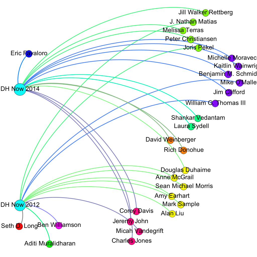
The disciplines are broken up by color: yellow is English, purple is History, green is Communication/Media Studies, red/pink is Library Science. I did this by adding a column to the nodes table and then partitioning by that attribute. Basically, it doesn’t seem like the disciplines are all that different or more varies now than they were two years ago. If I were to continue this visualization I would look at who is cited in the posts themselves. That way there would (presumably) by some more interesting things going on with edge weights, etc. As it is, the edge weights are all the same.
I’ve also produced a visualization of my Facebook network. There are tons of easy tutorials, but all you really need to know is the Facebook app Netvizz. The app will let you download a graph file of a few different kinds of networks. I found it pretty useful to play around with some statistics and layouts and such with a large data set. I settled on Force Atlas 2 and weighting the nodes by degree. The most interesting thing that came out of this was the way the different communities were structured. Gephi did a pretty good job of selecting distinct communities of friends–family, high school, college, some grade school.

You can see the one community that got propelled out of the main network (on the top of the visualization). These are all of the friends I’ve added since moving to Boston (mostly from Northeastern). One other interesting group is of people I met on a trip I took to Australia. They are a small teal community, floating off the top-right of the main mass of nodes, unconnected to anyone else in my network.
